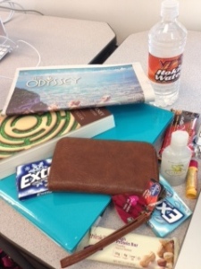
- Protein bar: V, S, L
- Chapstick: V, S, L
- Hand sanitizer: V, S, L
- Granola bar: V, S, L
- Extra gum- Winterfresh: V, S, L
- Extra gum- Smooth Mint: V, S, L
- Virginia Tech water bottle: V, S, L, G
- Twitter on iPhone: V, S, L, G
- Starbucks card: V, S, L
- Kroger card: V, S, L
- The Odyssey newspaper: V, S, L, G
- The Writer’s Journey textbook: V, S, L
Going through this assignment made me realize how works that are not digital, really only have visual, spatial, and linguistic elements. The most common elements are definitely color, shapes, layout and contrast. The only printed work that has the gestural element is the newspaper, because of the pictures of the faces featured on the cover. It is amazing how simple elements such as contrast and texture really make certain items stand out. This just goes to show how you do not need a ton of showy aspects to make a good design stand out.
